The secret to a beautiful screen print is a great artwork. If there is a problem with the design and is not caught ahead of time, it could result in financial loss and potentially damage the identity of the brand. If you are running a screen printing business, avoid these common mistakes to keep your final products looking awesome.
Working with Low-Quality Art Files
You’ll end up with a subpar finished product when you work with a file that has a low resolution or is too small. When you have a client who submits a file that’s of poor quality, resist the temptation to accept it for the sake of being accommodating. You’re ultimately doing your customers a disservice by not upholding your standards.
Before you accept anything from your clients, provide them with clear guidelines for submitting artwork to your business. Don’t hesitate to send the design back for revisions if their design fails to meet your standards.
Not Using the Pantone Matching System
The Pantone Matching System helps you obtain the colors you need in your shop. Since no two computer monitors represent colors in the same manner, getting the color you or your customers want is impossible without a Pantone book. Make sure to use the system. Customers who require more precise colors should give you the Pantone Matching System color codes they want in their final prints.
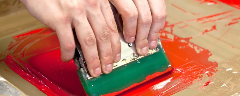
Using Too Many Colors

More doesn’t necessarily mean merrier when it comes to screen printing. Incorporating too many colors could make the final product appear jumbled and overly complicated. Instead of taking that route, adopt a “less is more” approach by simplifying the colors and details in your design. If clients give you a complicated print that features way too many colors, explain the limitations of screen printing to them and provide recommendations on simplifying the design.
Disregarding Typography
The details and styles of the fonts you use have a significant impact on your final design. The wrong typeface could make your artwork challenging to read. On top of that, using too many fonts could make the final product appear unsophisticated and chaotic.
When choosing typography for your artwork, go with a maximum of two typefaces. Additionally, do research on the look that your chosen fonts will give. Sans Serif fonts, for instance, tend to look more modern and cleaner while Fonts with serifs give off a classic look.
Skipping Quality Checks
Not performing any quality control can be tempting, especially during busy days. Resist this temptation by performing checks every single time. Before proceeding with the printing stage, remember to reassess the essential technical elements, such as dot-gain compensations, gradient overlaps, trapping, halftone specifics, and transparencies and densities of your colors.
Before sending the artwork to the press for printing, make sure to check the quality of the art file, use the Pantone Matching System, simplify the color and typography of the design, and perform quality control. When you’re able to catch and correct mistakes before the printing stage, you’ll be able to create a final product that your customers will love.